Top ↑
DESIGN SYSTEM v01 - Last Update: 07-09-2026-23:00(UTC)
Intro
I. Design System, what is it?
The Design System includes all the resources needed to create interfaces and user experiences on Tracim, from prototyping to integration.
II. Design System Objective
The Design System allows all the actors of Tracim's design to have a common and reference base. It allows common rules to be set up and good practices to be implemented.
III. Design System v01
Tracim aims to offer its users a simple and intuitive interface, accessible to all. The first version of the Design System goal is to make an inventory of the Tracim interface and to lay the foundations in order to be able to improve the coherence of the interface thereafter.
Follow established design patterns whenever possible.
Good practices
I. Accessibility
Never rely exclusively on color to convey information.
The contrast between text and background color should be at minimum 4.5 to 1. (to check: https://colorable.jxnblk.com/)
Always provide alt text for images / non-text content.
Pages should establish clear hierarchy using H1, H2, H3 etc.
Global Style
I. Color palettes
Recommendations:
Primary Palette : brand colors, neutrals, and a typically interactive digital blue.
Stack available colors in each hue, and treat the stack as a visualization to include important details compactly.
Scale color names between 0 and 100 based on HSL’s lightness
Check Contrast Early & Ritually
1. Gris
-
#f0f0f0
-
#e0e0e0
-
#b5b5b5
-
#525252
-
#333333
2. Suricates
3. Applications
-
#00cc00 - Documents
-
#428bca - Threads
-
#ffa500 - Files
-
#ff4b3a - Agendas
4. Rôles
5. Profiles
-
#3145f7 - User
-
#f2af2d - Trusted User
-
#ed0007 - Administrator
6. Status
-
#008000 - Validated
-
#3f52e3 - Open
-
#f63434 - Cancel
-
#ababab - Deprecated
II. Typography
Recommandations:
Naming your font size
The suggested line length for digital text is in the range of 50 to 75 characters on a line.
Line height, or line spacing, is commonly measured as a percentage of font size. Conventional wisdom is that line spacing of 130%-150% is ideal for readability, but even up to 200% is acceptable.
All-caps text — meaning text with all the letters capitalised — is best used sparingly. At body text sizes, capital letters — or simply caps — are harder to read than normal lowercase text.
Typography rules:
7 web typography rules
Style
Quicksand :
- Typeface
- Size
- Weight
- Line-height
- Letter-spacing
- Colour
- Spacing (padding, margin)
Page titles:
- Icon: 30x30px
- Text: Quicksand 30px
Dashboard titles:
Contents:
Comments:
Dashboard descriptions:
[WIP]
III. Icons
FontAwesome v4.7.0
https://fontawesome.com/v4.7.0/cheatsheet/
- - Files: fa-paperclip
- - Documents: fa-file-text-o
- - Thread: fa-comments-o
- - Office document: fa-file-o (same as bttn download current page)
- - Folders: fa-folder-o
- - Calendar: fa-calendar
- - Gallery: fa-picture-o
- - Searchbar: fa-search
- - Button send: fa-paper-plane-o
- - Button edit (html docs): fa-plus-circle (?) > to do : put the edit button
- - Button new version: fa-upload (?)
- - Button view/edit online: fa-edit (?)
- - Button download current page: fa-edit (same as office document)
- - Button download as pdf: fa-file-pdf-o
- - Button download file: fa-download
- - Button delete: fa-trash
- - Button close: fa-times
- - Button edit: fa-pencil
- - Dropdown list: fa-sort-desc
- - Open sidebar: fa-chevron-right
- - Close sidebar: fa-chevron-left
- - Open workspace: fa-chevron-down
- - Close workspace: fa-chevron-up
- - Timeline icon: fa-history
- - Timeline creation: fa-magic
- - Timeline new version: fa-edit
- - Share: fa-share-alt
- - Informations: fa-info-circle
- - Status open: fa-square-o
- - Status validate: fa-check-square-o
- - Status cancel: fa-close
- - Status deprecated: fa-warning (similar to warning icon)
- - List of contents: fa-th
- - Home: fa-home
IV. Grid
Spatial systems define the rules of sizing and spacing while grids help you arrange your content into structured propositions.
8pt linear scale for elements with a 4pt half step for spacing icons or small text blocks.
Interface Behaviors
I. Feedbacks
Rules:
- After each user action, the interface provides an adequate visual feedback.
- Windows/pop-ups/dialog boxes open near the clicked area or at least in the center of the screen (if they are modal)
- A visible title is assigned to each page/window/dialog-box/display area.
- The icon of the currently selected function is well differentiated from the icons around
- When hovering, all clickable/moveable elements have an 'on mouse over' effect (pointer change, color change...).
- If drag&drop is possible, during the action there is a specific visual feedback on the concerned element
- If the system performs a time-consuming action, an indication is given that the operation is in progress
- If the system performs an action that takes time, an indication is given as to its progress (if total duration > 6 sec).
- When the user is in a particular module, an indication is given of his position in the software.
- If the user is "logged in", this information appears clearly on the screen
- If there is scrolling in the data tables, the headers always remain visible.
- The user is informed of the level of rights relative to his profile.
- The system provides feedback when a document/item is being edited by another user.
- The system provides an indication of when and by whom each document/item was last changed.
II. User Feeling of Control
Rules:
- Whenever possible and relevant, the system allows the user to anticipate the results of his actions (e.g. "Preview" function).
- It is possible to stop/pause a long operation in progress
- At each instant/step, only the options/functions useful to the user are provided to him/her.
- An "undo" function is available in order to erase the last user actions
- A "redo" function is available in order to restore the user's undone actions
- Actions that have significant and/or non-reversible consequences (e.g. destruction of data) require confirmation from the user.
III. Standards Compliance
Rules:
- Whenever possible, keyboard shortcuts are standard (CTRL+C, CTRL+V...).
- Terms used for key concepts are consistent throughout the interface
- When relevant, right-clicking on an item displays a contextual menu
- The "classic" elements of the HMIs (drop-down menus, input fields, etc.) have a standard and easily recognizable visual appearance.
IV. Errors Management
Rules:
- When the user closes a module/document without having saved, a pop-up informs him/her and offers to save it.
- he software offers autocompletion in the following input fields
- Temporarily unavailable buttons/icons/links are visually grayed out or do not appear
- In the forms, the mandatory fields are clearly indicated
- Error message language is within the user's reach and avoids "computer jargon".
- Error messages do not explicitly or implicitly criticize the user.
- Error messages provide explanations as to the origin of the problem and its solution.
- Error messages are short and unambiguous
- When a maximum number of characters is available in an input field, a counter scrolls to warn the user of the remaining space.
- The system prevents the user from entering erroneous data (too long/short, text instead of numbers...)
- When the user attempts to perform an unauthorized action (e.g. drag&drop into a prohibited area), the system provides explanatory feedback.
V. Flexibility
Rules:
- Several different ways to access the same feature are provided (right click, icon, menu, shortcut...)
- Color is not the only way to convey information
- The display is compatible with several resolutions and screen sizes
- Where relevant, graphical representations of the data can be saved or exported.
VI. Cognitive Overload
Rules:
- The symbols of the icons are unambiguous (1 symbol = 1 icon = 1 function)
- Data tables offer filtering/sorting functions
- No more than 5 colors (with a precise meaning) are used in each screen page.
- o more than 9 colors (with a specific meaning) are used in the entire software.
- The maximum number of items in each menu and level does not exceed 9.
- The titles of different pages/windows/dialog-boxes are not confusing to each other.
VII. Help in App
Rules:
- A "Help" section is present
- The user has at his disposal an e-mail address/form to request specific help from the after-sales service.
- Clear and complete documentation is available
- Tutorials are available to facilitate the discovery and use of the software.
- Tootips and other forms of assistance only provide information that is relevant and appropriate to the target audience.
Interface Elements
I. Atoms
1. Buttons
Rules:
Buttons are used to initialize an action. Button labels express what action will occur when the user interacts with it.
Primary buttons always appear to the right. Secondary buttons appear to the left of the primary button.
Design Better Buttons
When put an icon and when don't?
Behavior:
- When the action isn't possible, the button is in inactive state
- When the user put the mouse on the button, the button is in hover state
- When the user clicks on the button, it launch the action and a feedback has to be sent (page update, popup, loader...)
Primary Action Buttons
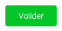
Normal:
- Padding: 10px 25px
- Text color: #fdfdfd
- Background-color: #7d4e24 (brown) / #00cc00 (green) / #428bca (blue) / #ffa500 (orange)
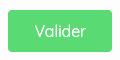
Inactive:
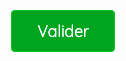
Hover:
- Background-color: #6a421f (dark brown) / #00ad00 (dark green) / #3277b2 (dark blue) / #d98c00 (dark orange)
Secondary Action Buttons
Normal:
- Padding:
- Text color:
- Background-color:
Inactive:
Hover:
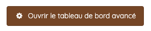
Icon + text buttons
Normal:
- Padding: 10px 15px
- Text color: #333333
- Border-color: #7d4e24 (brown) / #00cc00 (green) / #428bca (blue) / #ffa500 (orange)


Hover:
- Text color: #fdfdfd
- Background-color: #6a421f (dark brown) / #00ad00 (dark green) / #3277b2 (dark blue) / #d98c00 (dark orange)
Minimized Buttons
Normal:
- Padding:
- Text color:
- Background-color:
Components
à mettre à jour par les fronts
2. Avatars
Recommandations:
Ideas to design better avatars: Design Better Avatars by UX Collective
Header Avatar
- Avatar image (round): 40x40px
- User name: Quicksand 14px
- Margin between avatar & user name: 10px
Components
à mettre à jour par les fronts
3. Links
Recommandations:
Links are used primarily as a navigational element. Links may also change what or how data is displayed (i.e., view more, show all).
- Include a link whenever referencing external content.
- Avoid phrases like "click here." Instead, use language that describes the content you're linking to. For example: download our catalog.
Style
Content links:
Comment links:
Description links:

Components
à mettre à jour par les fronts
4. Shadows
Recommandations:
text
Style
text
Components
à mettre à jour par les fronts
II. Molecules
1. Search bar
Recommandations:
Search enables users to specify a word or a phrase to find relevant pieces of content without the use of navigation. Search can be used as the primary means of discovering content, or as a filter to aid the user in finding content.
Set the user’s context for the search with helpful placeholder text within the search field (search documents), that pertains to the page or section the search box is in. Search in the global header should just say search.
Search results
Clearly show which results are being displayed with labels or headers (i.e. Results for X).
Categorize the search results if they come from different areas (eg. docs, services, apps, tutorials, blogs).
Give the user control over their viewing options and ability to sort results (eg. relevancy, popularity, ratings, date).
Have a clear, “no results,” message and offer suggestions if possible.
Have smart algorithms that can search for similar terms or can search even with misspelled words.
Include enough of a description in the results for users to make a judgement as to whether that particular result is relevant.
Highlight the search term in the results, where appropriate.
Style
wip
2. Forms
Recommandations:
Labels should be clear and concise.
Forms are used for submitting data so be as concise as possible when designing. Keep it short. Think about each field and what value the data will provide. What do you gain by collecting this information?
Labels: Inform users what the corresponding input fields mean.
Input fields: Enable users to provide information. Information can be entered through a variety of different input fields ranging from text fields, checkboxes, and many other types.
Help text: Provides assistance on how to fill out a field. Help text is optional.
Placeholder text: Hints at what goes into a field. Placeholder text is optional.
Actions: Allow users to submit a form.
Validation: Ensures the data submitted by the user conforms to acceptable parameters.
Effective error messaging can help the user to understand the problem and how to fix it. First, inform the user what has happened, then provide guidance on next steps or possible resolutions. Inline notifications can be used to state the general problem with the users input, such as “Please input the required fields.” Inline Notifications can occur pre or post submission, depending on the type of data the user is inputting.
Style
text
Components
à mettre à jour par les fronts
3. Comments
Recommandations:
text
Style
text
Components
à mettre à jour par les fronts
4. Comment area
Recommandations:
text
Style
text
Components
à mettre à jour par les fronts
5. Drop down list
Recommandations:
text
Style
text

Components
à mettre à jour par les fronts
6. Notifications / Flash message
Recommandations:
It’s important to keep users informed and send notifications when there is an update or status change they should be aware of. Users should always be given appropriate and timely messages to help them understand whether they are moving towards their goal. Ensure your notifications are relevant, timely, and informative.
Flash message : Notification status helps convey the information being communicated. These statuses correspond with a color and icon to provide a consistent, universal experience for users.
Inline notifications
Place inline notifications near their related items.
In forms, inline notifications can be placed either at the top or bottom.
Keep the message under two lines.
Do not cover other content with inline notifications.
The notification width varies based on the context and page layout.
Be descriptive and give users clear next steps.
Banner:
Banners should be placed at the top of the content area they relate to.
Do not cover other content with a banner notification.
Place system-wide messages directly below the main header or navigation bar.
Banners are not sticky and should scroll with the other content on the page.
Only show one banner at a time.
Notification panel:
Give users the ability to manage notification preferences.
Don’t send the same notification multiple times if users don’t interact with it.
List notifications in chronological order.
Notifications can be grouped by source or urgency.
Modal:
Only display one modal notification at a time.
Use modals when you need to immediately interrupt a user’s task.
Give users clear steps to resolve and dismiss the notification.
Style
text
Components
à mettre à jour par les fronts
7. Roles
Recommandations:
text
Style
text
Components
à mettre à jour par les fronts
8. Profiles
Recommandations:
text
Style
text
Components
à mettre à jour par les fronts
9. Breadcrumbs
Recommandations:
text
Style
text

Components
à mettre à jour par les fronts
10. Item lists
Recommandations:
text
Style
text
Components
à mettre à jour par les fronts
11. Application tabs
Recommandations:
text
Style
text
Components
à mettre à jour par les fronts
12. App header
Recommandations:
text
Style
text
Components
à mettre à jour par les fronts
13. App toolbar
Recommandations:
text
Style
text
Components
à mettre à jour par les fronts
14. Lists of content
Recommandations:
Lists consist of related content grouped together and organized vertically.
Use bulleted lists when you don’t need to convey a specific order for list items.
Use numbered lists when you need to convey a priority, hierarchy, or sequence between list items.
Style
text
Components
à mettre à jour par les fronts
15. Notification wall
WIP
- Notifications not readed: background-color : #F6F6F6;
- Notifications readed: color (text): #595959;
- Notifications hover: background-color : grey-hover
- Design blue point: fa-circle icon, 8px, color #3F9FF7
- Mentioned at comment icon: fa-comment-o
- Added to a shared space icon: fa-user-o
- New version icon: fa-history
- New status icon: fa-random
- Content creation icon: fa-magic
- Notification's height: 50px
- Icons size of notifications: 23px
- See more button area's height: 60px
- Design point bleu : icone font awesome fa-circle 8 pt #3F9FF7
- Icône bulle : fa-comment-o
- Icône user : fa-user-o
- Icône mention : fa-check-square-o
- Icône nouvelle version : fa-history
- Icône création de contenu : fa-magic
- Hauteur des notifs : 50px
- Font size notifs : 14px
- Icônes type de notifs : 23 px
- Hauteur zone tags : 38px
- Icône enveloppe : fa-envelope-open-o
- Zone bouton voir plus hauteur : 60px
Behavior :
Survol notification : la zone se grise un peu + et un icône s'affiche pour les notifications non lues afin de pouvoir les passer en lues en cliquant sur l'icône.
Clic sur la zone de notification : lien qui envoie vers le contenu qui a eu une actualité
Bouton 'tout marquer comme lu' : passe toutes les notifications filtrées (même celles dans les pages suivantes) en lues
Switch mes mentions -> toute les notifications : affiche toutes les notifications qui s'affichent en non lues sauf si l'utilisateur a déjà cliqué dessus / marqué en lu. Si l'user switch plusieurs fois ça garde en mémoire les lues / non lues.
Icône sliders : clic dessus ouvre le panel avec le switch mes mentions -> toutes les notifications.
> Clic sur la zone de notification : lien qui envoie vers le contenu qui a eu une actualité
S'il s'agit d'un commentaire, il faut que ça scrolle jusqu'au commentaire. Si c'est une mention dans le corps du contenu, ça ne scrolle pas
Behavior point bleu (pour plus tard) : lorsque la notification est non lue, un point bleu l'indique. Lorsque l'utilisateur clique sur le point bleu, la notification passe en 'lu' dans rediriger l'utilisateur (permet de mettre en lu certaines notifications sans avoir à visiter le lien, cible : utilisateurs avancés).
Future Tags:
- Tags: background-color : #E7E8EA;
- Filter button icon: fa-sliders
- Font size of the tags: 12px
- Icons size of the tags: 12px
- Tags height: 20px
- Height of the tags area: 38px
- Font size tags : 12px
- Icônes tags : 12px
- Hauteur tags : 20px
III. Organisms
1. Gallery
2. Header
3. Footer
4. Timeline
5. Users lists
6. Shared space lists + sidebar filters
7. Upload popup
8. Recent activity
9. Popup create
10. Login popup
11. Guest download
12. Guest upload
13. Timeline
14. Search results
15. Contents lists
Others
Liste des règles à faire :
- Contrastes des textes
- Rationnalisation des couleurs
- Survols des listes
TO DO
- Nommer les couleurs
- Tout traduire en anglais
- Insérer des images des icônes
- Mettre en avant les incohérences
- Recommandations dans un autre fichiers
- Les animations / mouvements
- Reprendre les règles du fichiers d'évaluation des ergonomies
Sources
Carbon Design System (IBM)